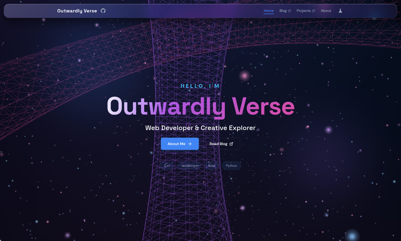
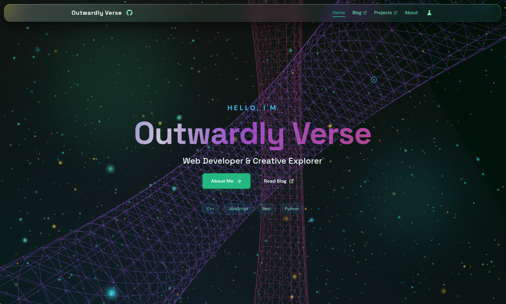
This is made with Three.js. If it’s slow or you find any bugs, feel free to leave a comment and I’ll keep optimizing it! You can change the theme in the top right corner~
If you like it, could you give me a star? 
9 Likes
Pretty cool! I think it would look even better if the main section’s background matched the style of the navigation bar (maybe?).
2 Likes
It’s kind of inspired by Telegram’s style, which is pretty nice.
1 Like
Nicely done!
1 Like
Not bad 
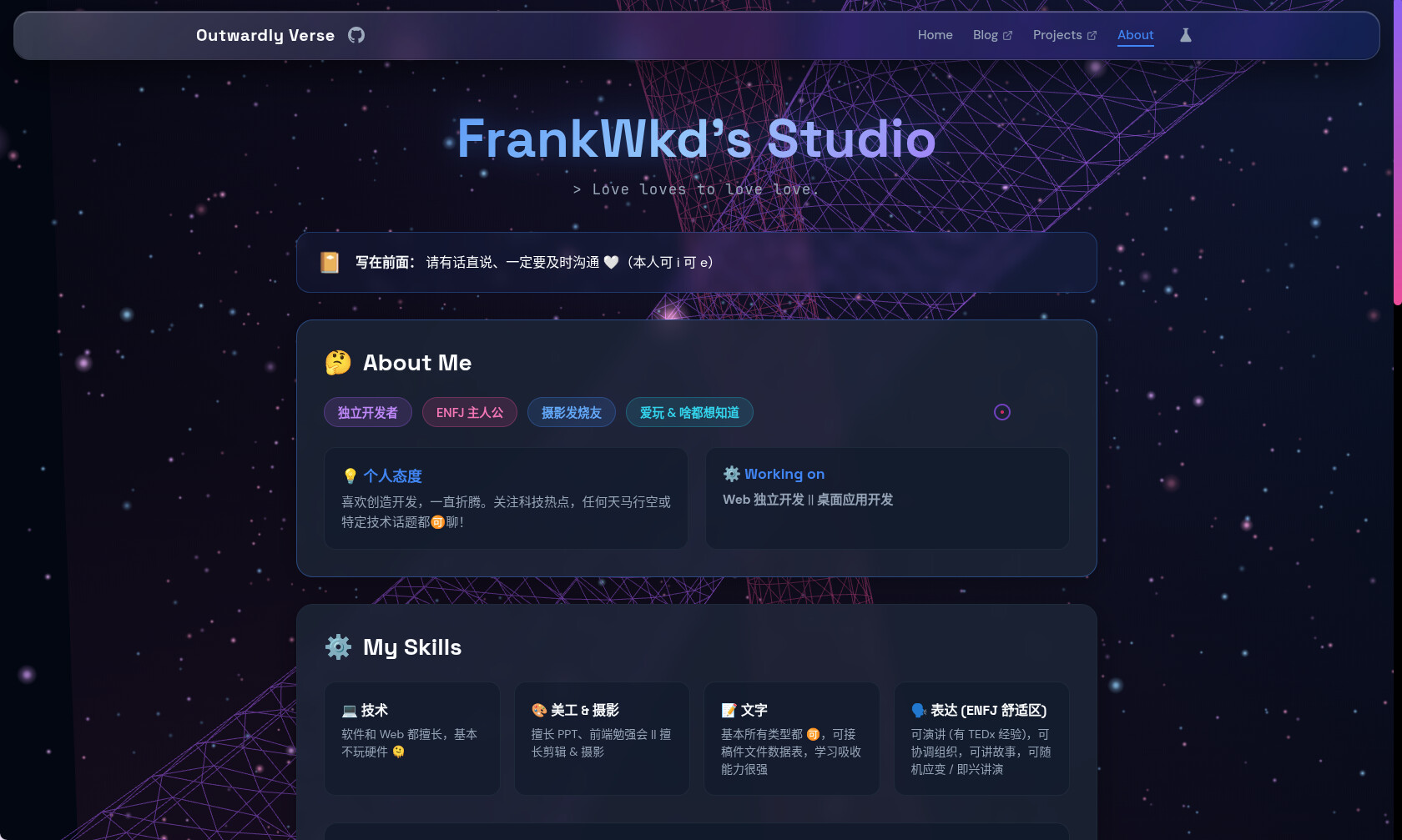
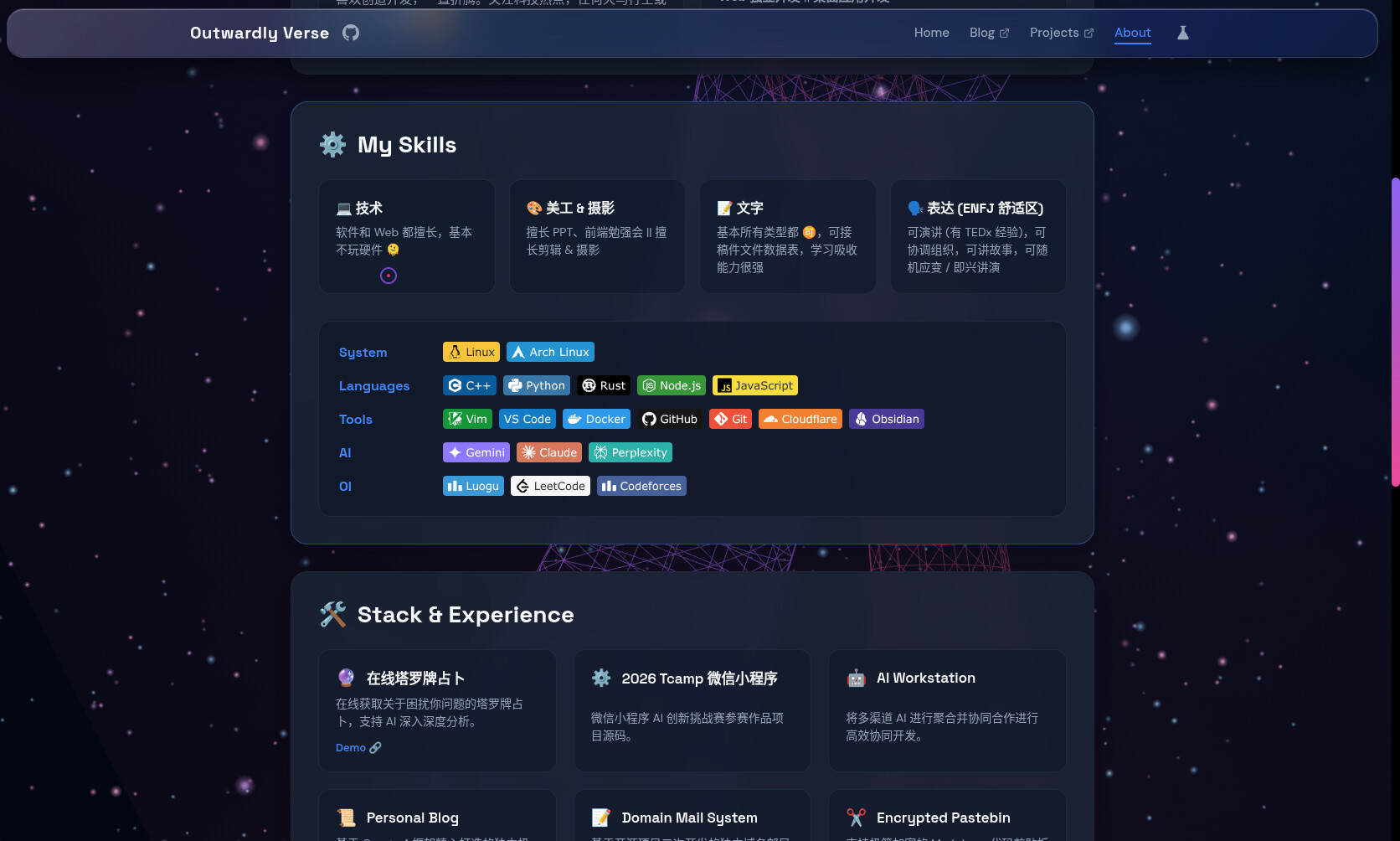
Thanks for putting in the effort all night. I took a look, and overall it looks really clean. The mobile layout could use a bit more optimization, though. I’ve given it a star to show my support.
1 Like
Spent the whole night on adult websites 
It wasn’t easy to pull this off in just one night—I’ve already gone and given it a star. Overall, it looks pretty good; adding some animations would make it even better.
2 Likes
The background grid in the screenshot is a bit distracting from the text. Darkening it slightly behind the title would make it clearer.

Looks pretty cool. Not bad.
Thanks for sharing!
The layout looks good.